-

- Sophia Condon
Sophia
Condon
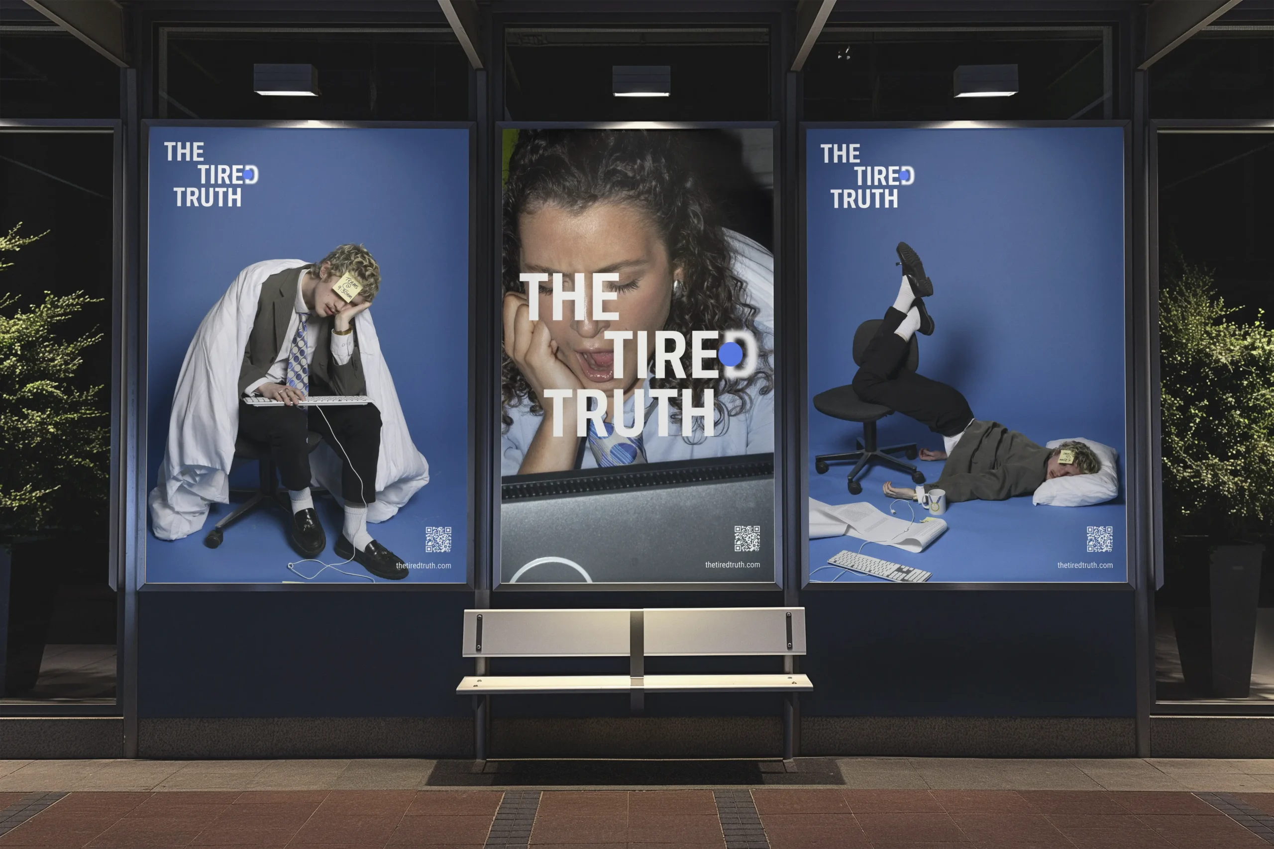

The Tired Truth
This integrated campaign was created to raise awareness of the impact of sleep deprivation on workplace performance, targeting office workers who often overlook the importance of rest in pursuit of productivity. The campaign reframes sleep not as a passive indulgence, but as a biological necessity essential for clarity, focus, and long-term health.
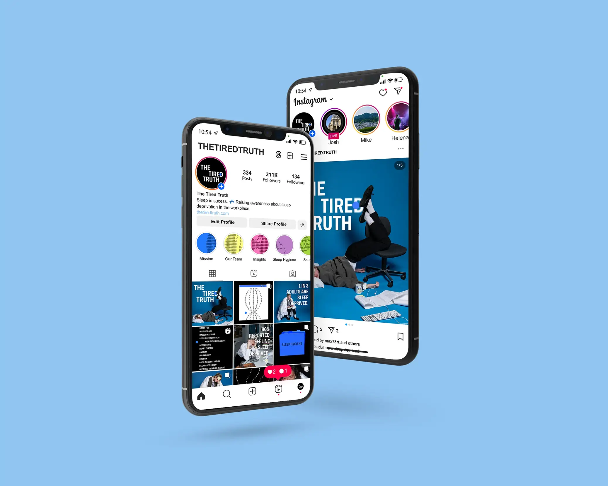
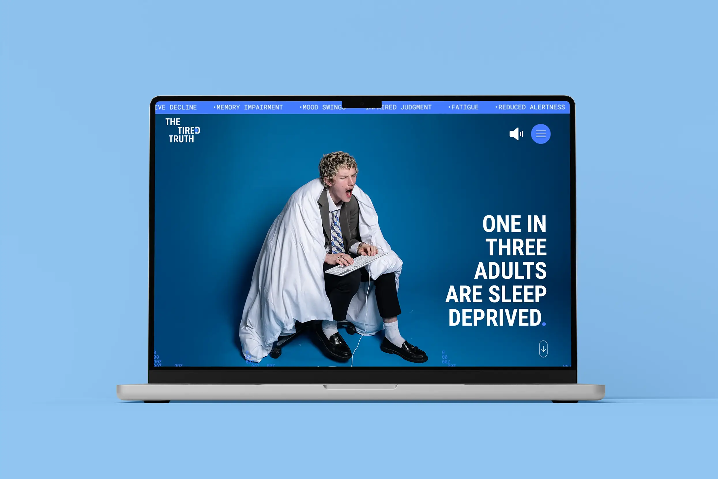
At the core of the campaign is an interactive website designed to educate users through engaging visuals and tools, including The Fatigue Report and Sleep Hygiene tips for better sleep habits. The site acts as a digital hub, blending information with interactivity to make the message both memorable and actionable. The visual language is defined by kinetic typography and humorous sleepy photography, which together strike a balance between wit and urgency. Typography is animated to reflect the ongoing, compounding effects of sleep loss, lagging behind, and distorting to illustrate how fatigue builds over time. The photography features stylized office settings and exaggerated tired poses, adding a layer of relatability and visual storytelling that connects directly with the audience.
Key messaging, such as ‘Sleep is Not a Luxury’, cuts through cultural misconceptions about hustle culture and sleepless success, challenging the narrative that burnout is a badge of honour. Instead, the campaign positions sleep as a tool for sustainable performance and wellbeing.
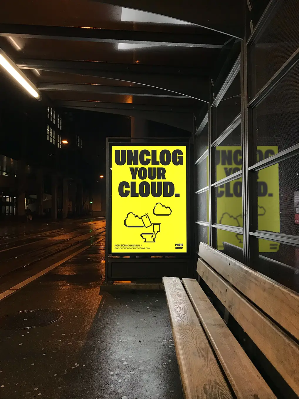
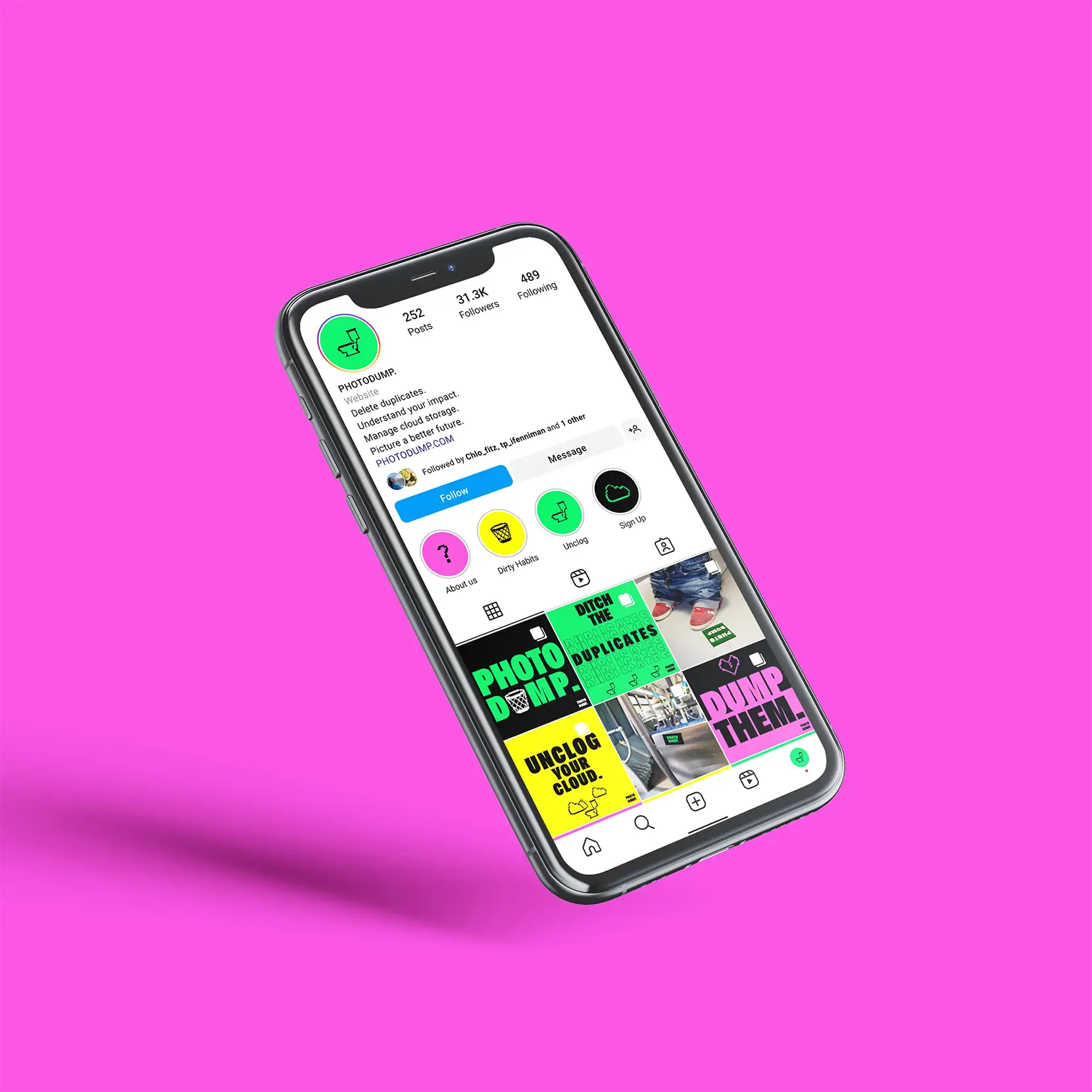
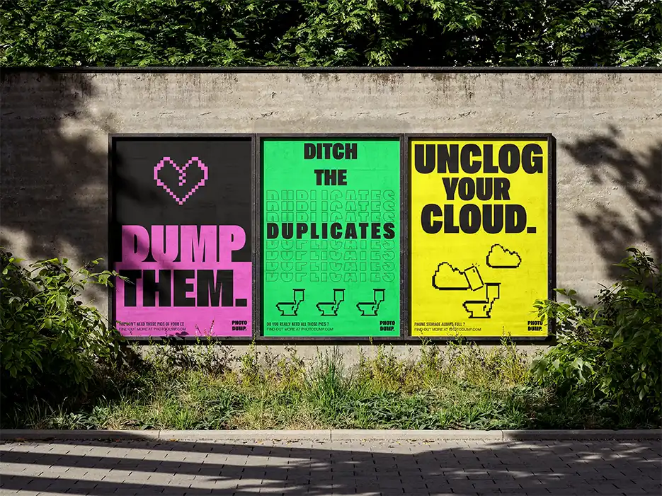
Photo Dump
Photo Dump is a tongue-in-cheek campaign created to raise awareness about the growing issue of digital waste, particularly the buildup of unnecessary photos, videos, and files stored in the cloud. Targeting Gen Z, a generation that documents and stores much of their lives digitally, the campaign reframes digital clutter as a waste problem, one that’s invisible but impactful.
The concept takes a literal, playful approach to the idea of a photo dump, featuring a bold, pixelated illustration of a toilet as its central graphic. Paired with punchy copy like ‘Unclog Your Cloud’, ‘Dump Them’, and ‘Ditch the Duplicates’, the campaign uses humour and visual metaphor to cut through digital noise and get the message across quickly.
The typography is bold, blocky, and direct, reflecting the no-nonsense tone of the message, while the electric colour palette captures Gen Z’s attention and reflects the digital-native world they live in. The playful, almost chaotic aesthetic leans into meme culture and visual irony to make the campaign both relatable and shareable.
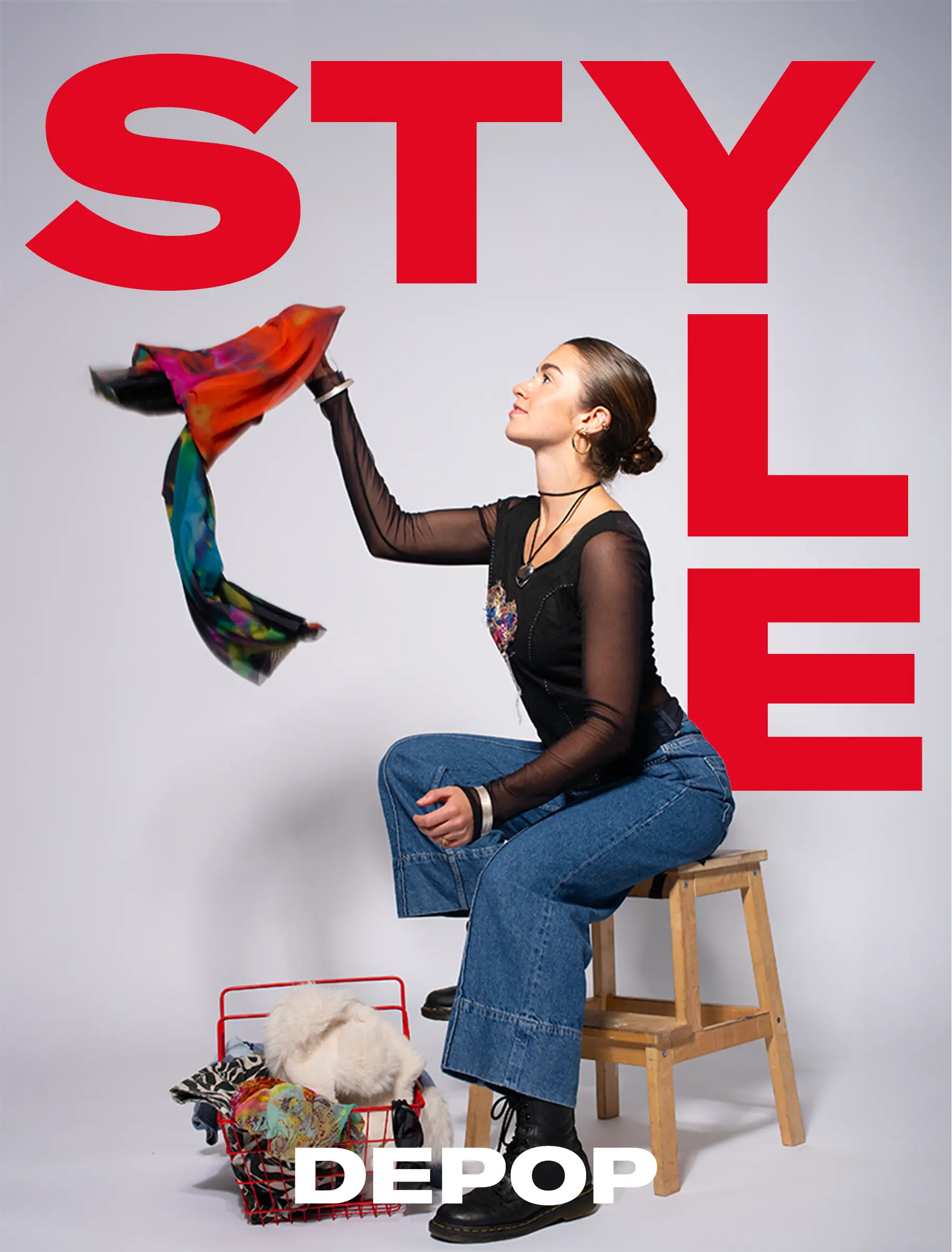
Depop Swap
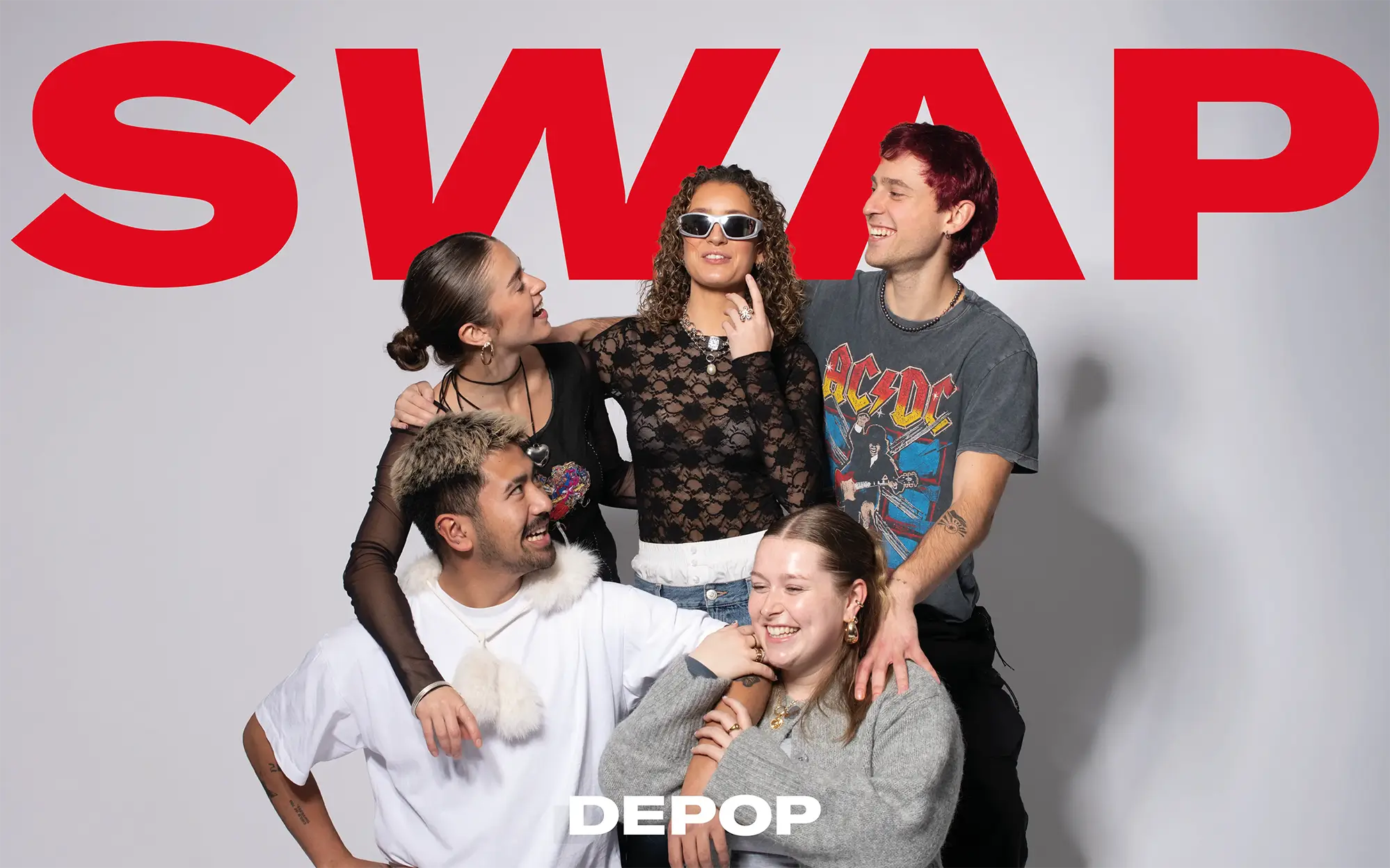
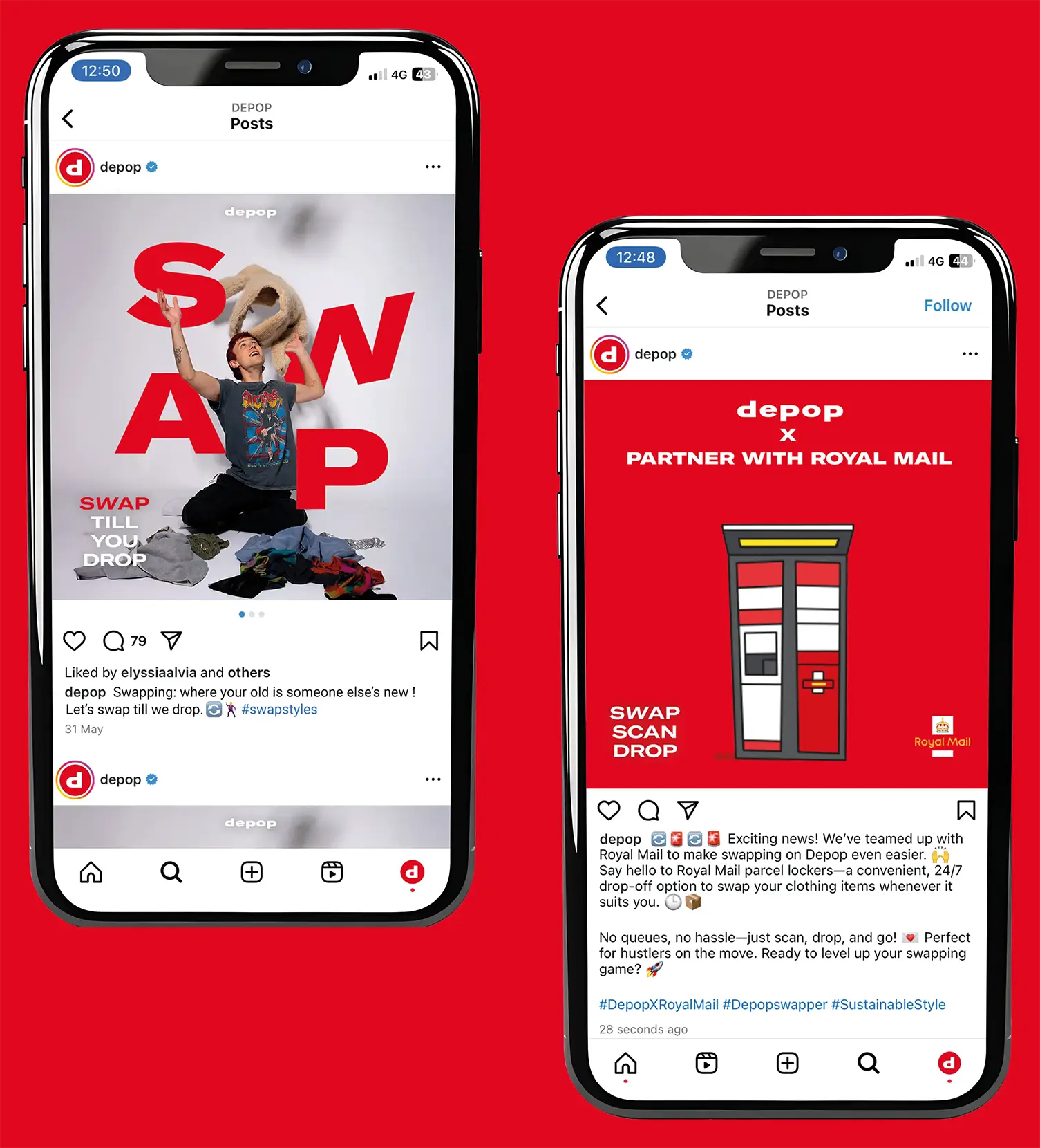
This campaign was developed to promote Depop’s new in-app swapping feature, offering a more sustainable and community-driven alternative to fast fashion. Titled Depop Swap, the strategy focuses on encouraging Gen Z users to swap rather than sell, reframing second hand fashion as both stylish and circular.
At the heart of the campaign is the tagline ‘Swap, Style, Save’, highlighting the triple benefit of swapping: refreshing your wardrobe, expressing your personal style, and reducing fashion waste. In collaboration with Royal Mail Parcel Lockers, the campaign extends its message with a secondary call to action: ‘Swap, Drop, Collect’, communicating the added convenience and accessibility of the new feature.
The visual identity is bold, youthful, and fashion-forward, reflecting the Depop aesthetic while appealing to a community of trend-conscious, socially aware users. Photography features a diverse, style-savvy group of friends exchanging outfits, capturing the energy of real-life connection and self-expression.