-

- Arnnon Gavioli
Arnnon
Gavioli

MÁSCARA & FESTIVAL
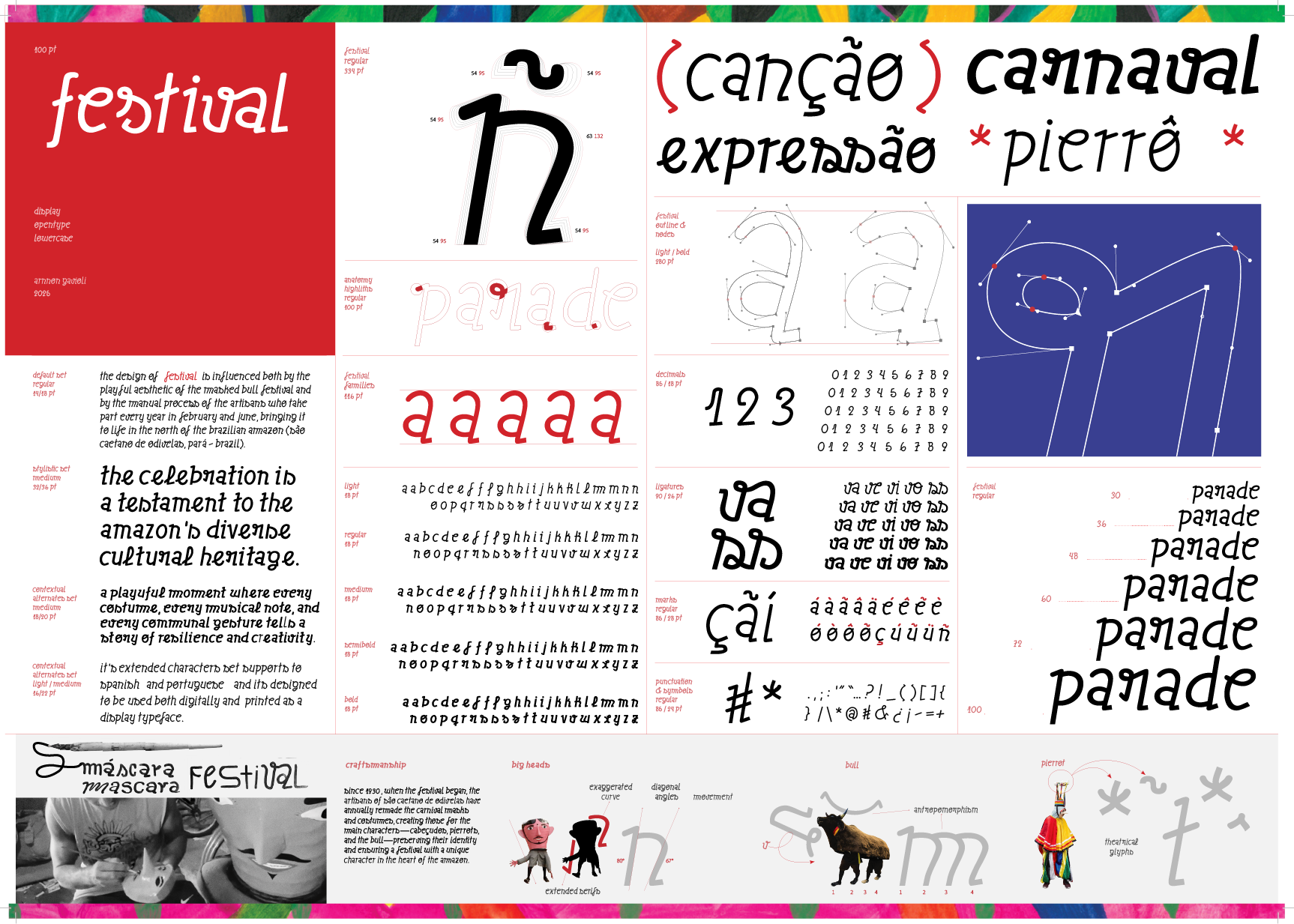
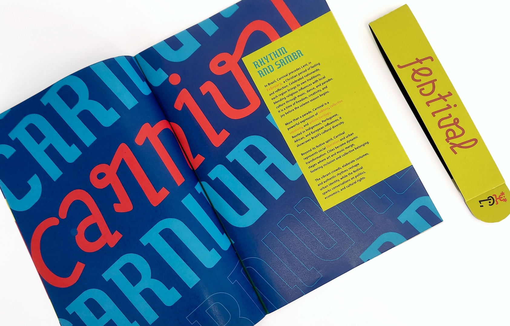
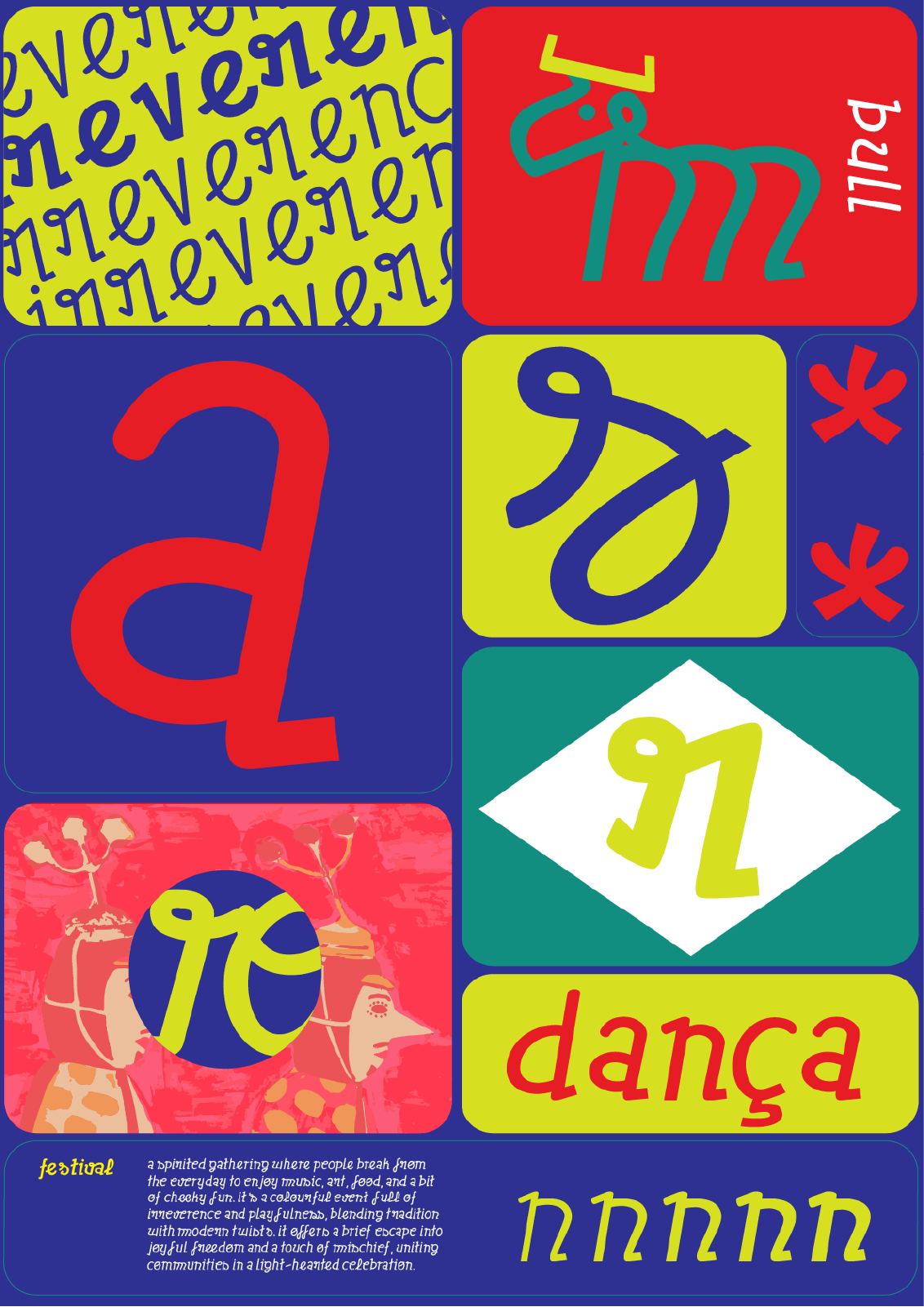
Inspired by the Boi de Máscaras (Masked Bull) festival, celebrated in São Caetano de Odivelas, northern Brazil, this project introduces a typographic system that captures the event’s vibrant energy, movement, and rich cultural identity. This project resulted in the creation of two original display type families, Festival and Máscaras, both developed through a combination of digital processes and hands-on experimentation. Designed from the ground up, these typefaces embody the vibrant aesthetics, expressive energy, and rhythmic spirit of the celebration that inspired them, capturing its dynamic visual language in typographic form.
The project explores handcrafted processes not only in the design of the typefaces but also in the accompanying illustrations, adding a tactile and expressive layer to the work. A printed booklet was also developed to present the festival’s context and offer a tangible space to showcase the typefaces in use. Its primary goal is to serve as a practical and visual tool for the local community, while also reaching cultural organisations, designers, and those interested in typography and culture. It celebrates the Masked Bull Festival as a living cultural expression and helps preserve and share its identity.
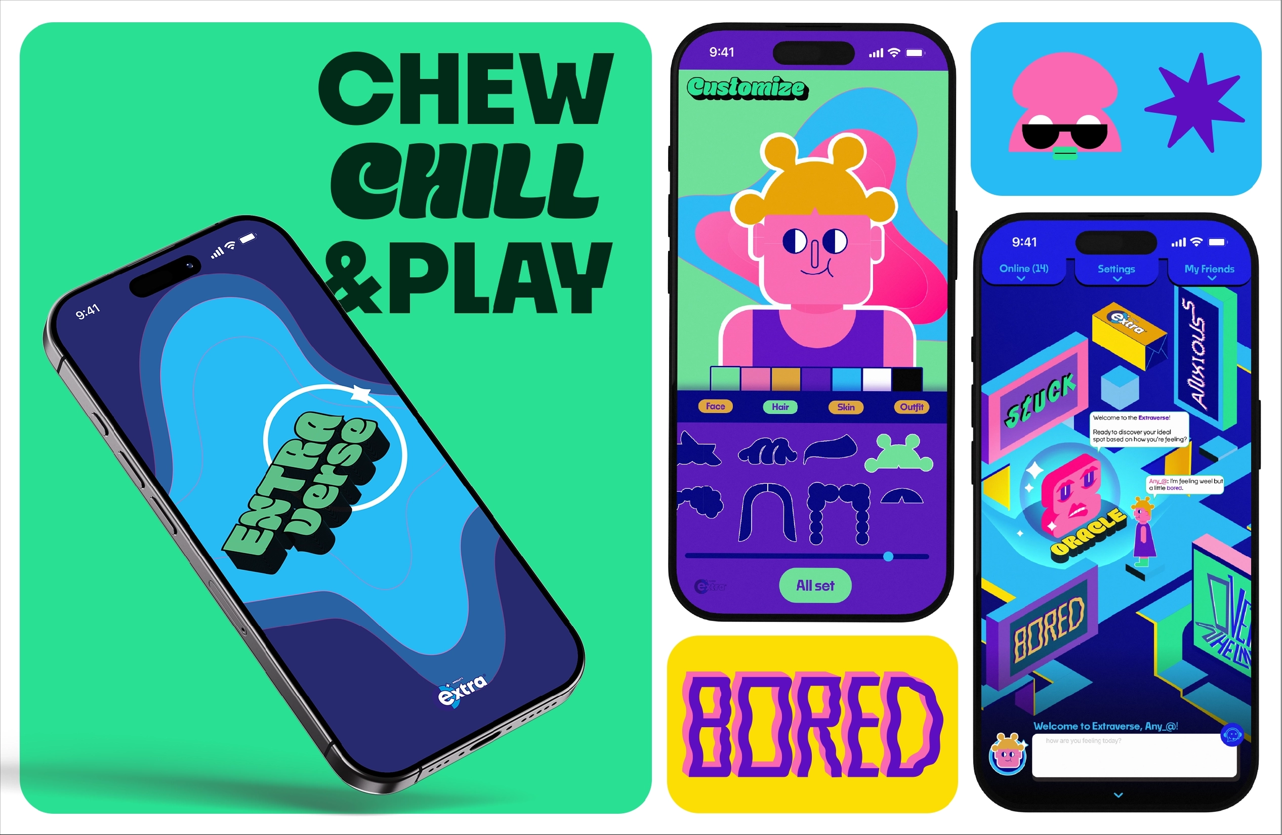
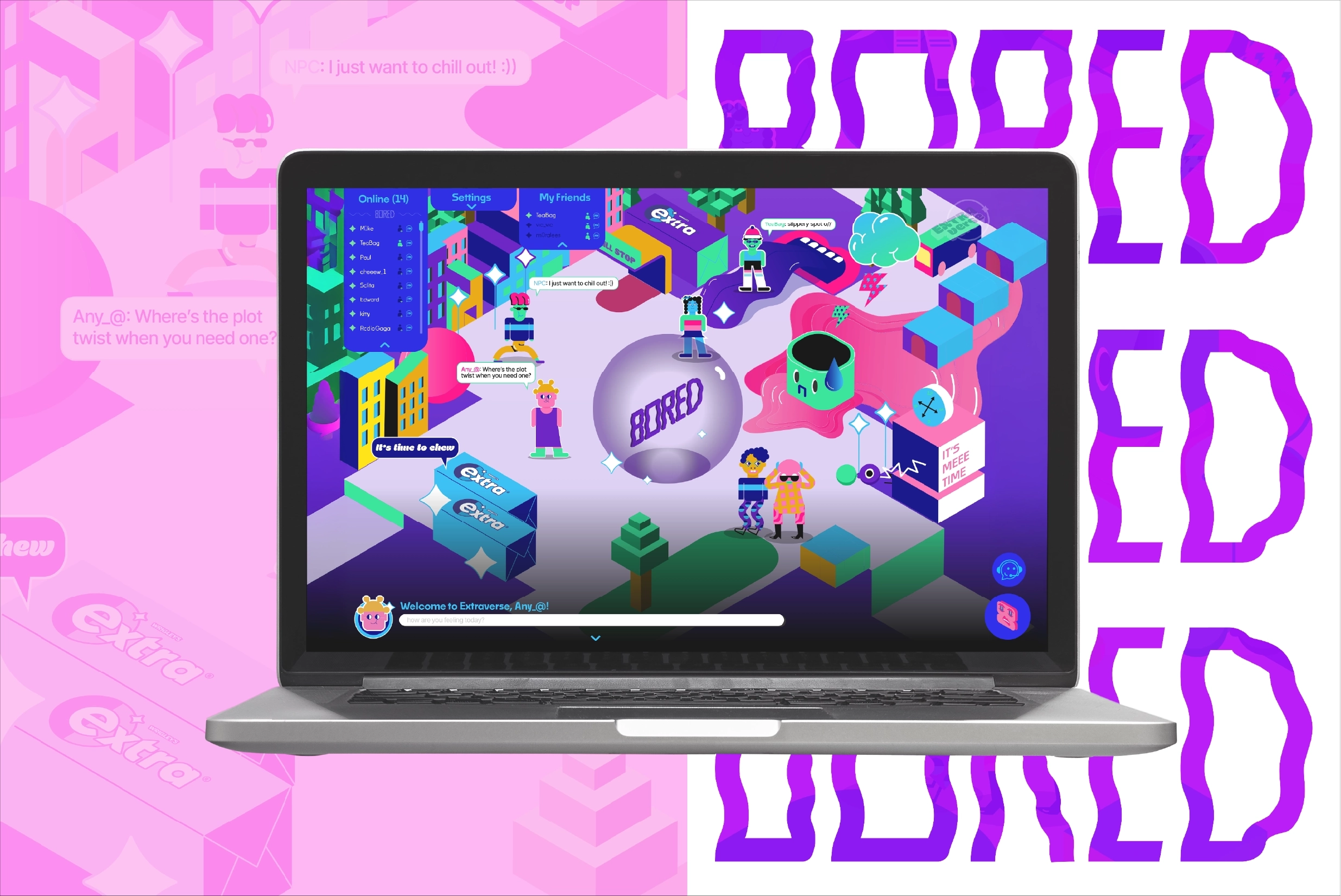

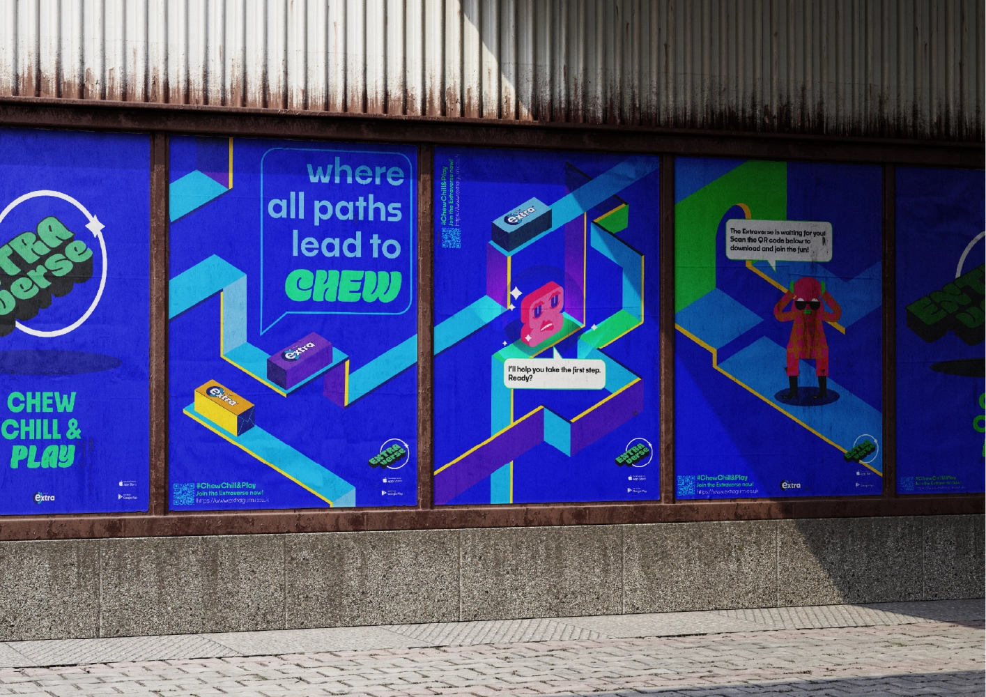
ExtraVerse
Extraverse is a mobile and web-based chat game where users customise avatars, connect via geolocation, and explore mood-based chat rooms. Inspired by Gen Z platforms like Reddit and Twitter (X), it offers an interactive, moderated and visually engaging metaverse beyond text-based networks. The goal is to chat, meet others, and relax in a virtual space that connects the Extra brand with well-being. A game chew chill & play!
In Extraverse, users enter a themed universe based on their mood, exploring interactive maps with NPCs and props. As players move through the environment, the map expands, revealing new areas. The Oracle is always accessible via an icon in the lower-right corner to bring the player to a different map.
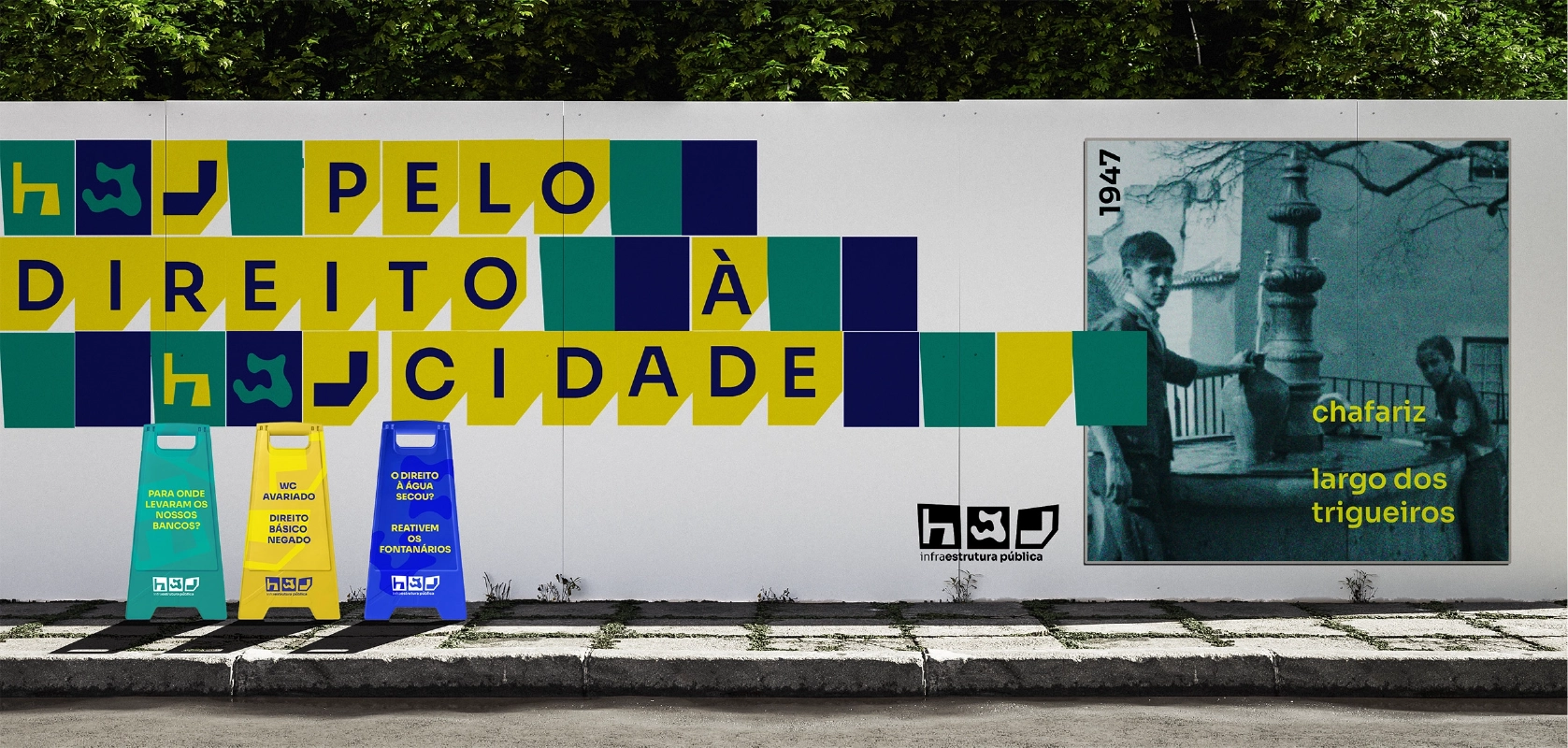
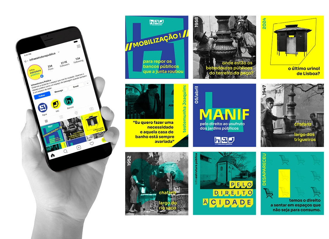
Infraestrutura Pública (Public Infraestructure)
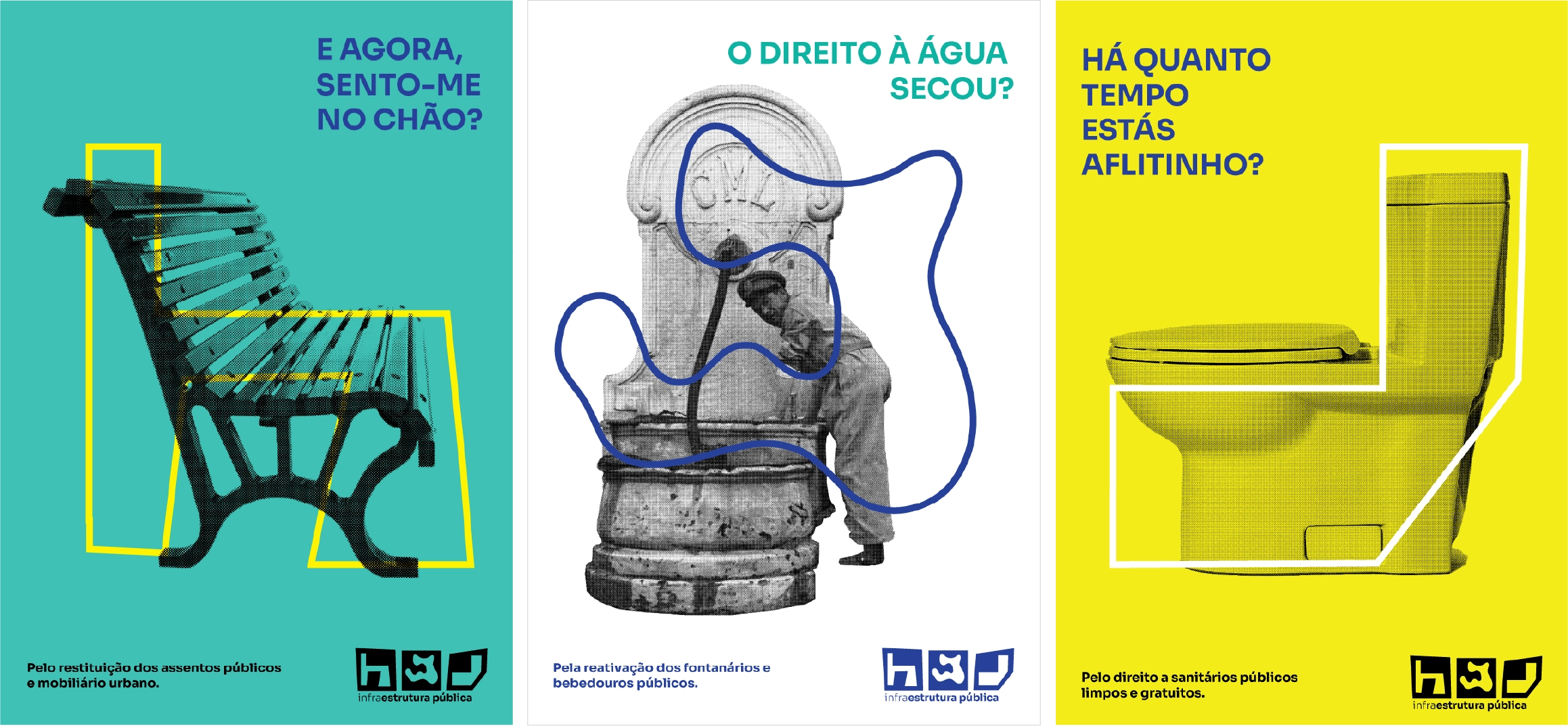
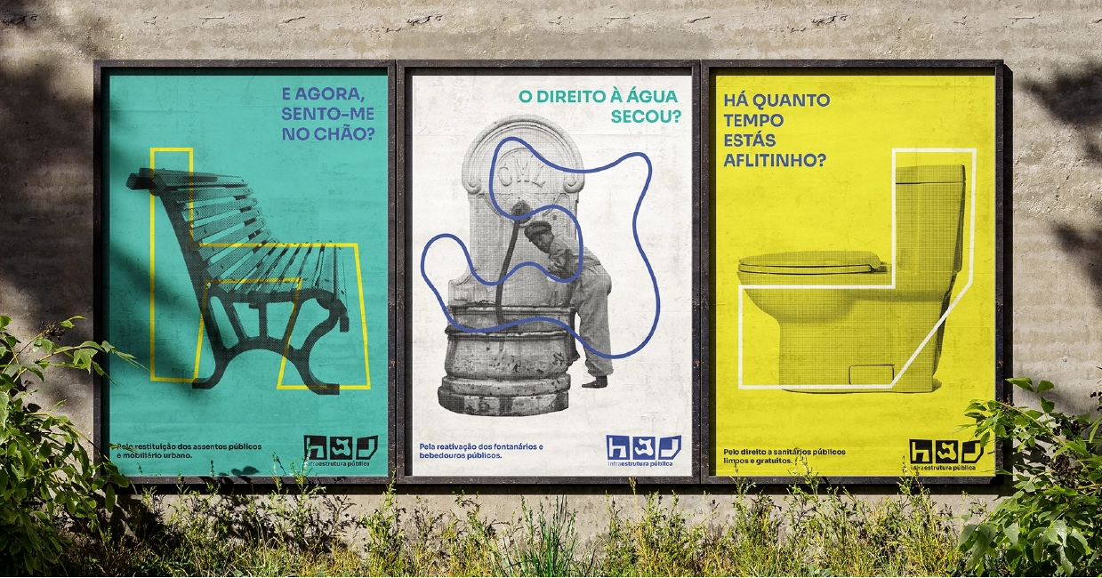
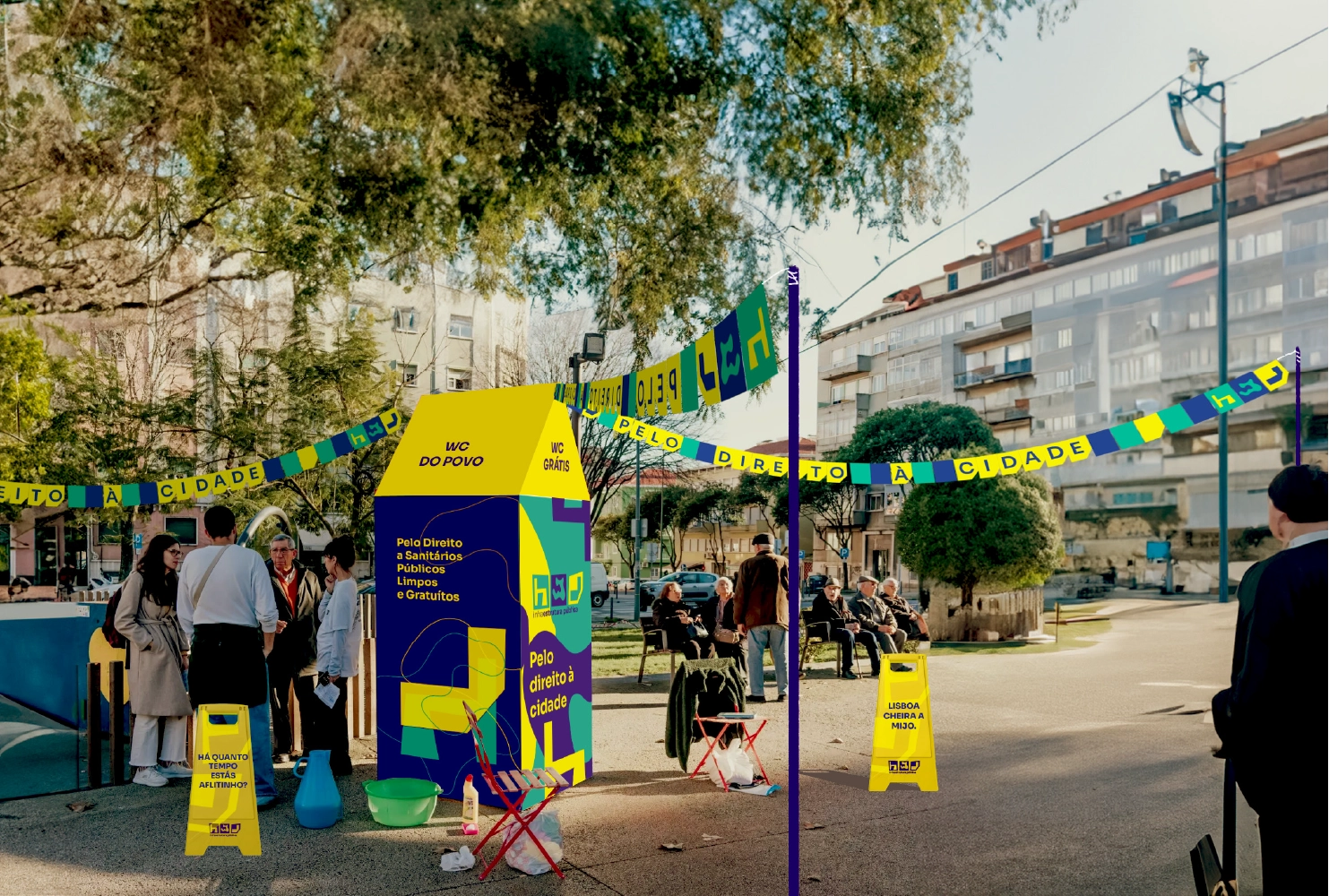
Public Infrastructure is a movement that emerged from Lisbon’s civil society. It advocates for the reactivation of the city’s basic public infrastructure that once functioned well, including: clean and free public toilets; access to drinking water through fountains and public taps; and access to urban furniture in public squares, such as park benches.
Based on this scope, the project developed the movement’s visual identity (logo) and proposed communication strategies for social media and, most importantly, public space interventions – the main approach used by the organisers. These include actions like installing temporary toilets and placing water bottles for handwashing in public areas.
The project identified that the core concept of the identity lies in the trio: the right to water, the right to public toilets, and the right to places to sit. The notion of absence is also central, reflecting what the movement stands against – the lack of these essential public services.