-

- Sebastian Zabre
Sebastian
Zabre
Service Charge
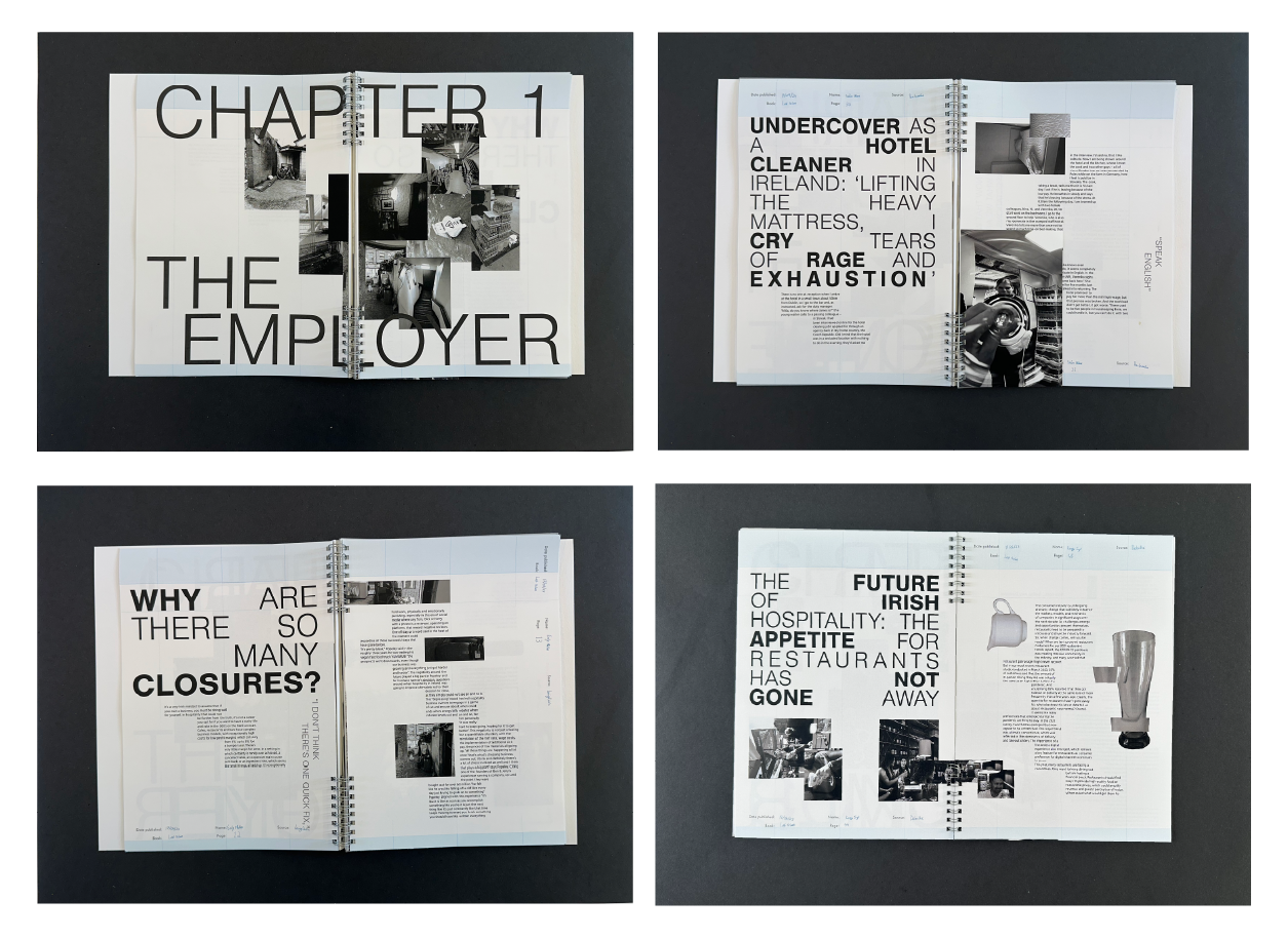
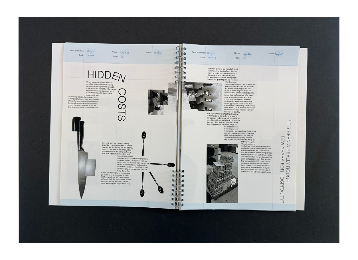
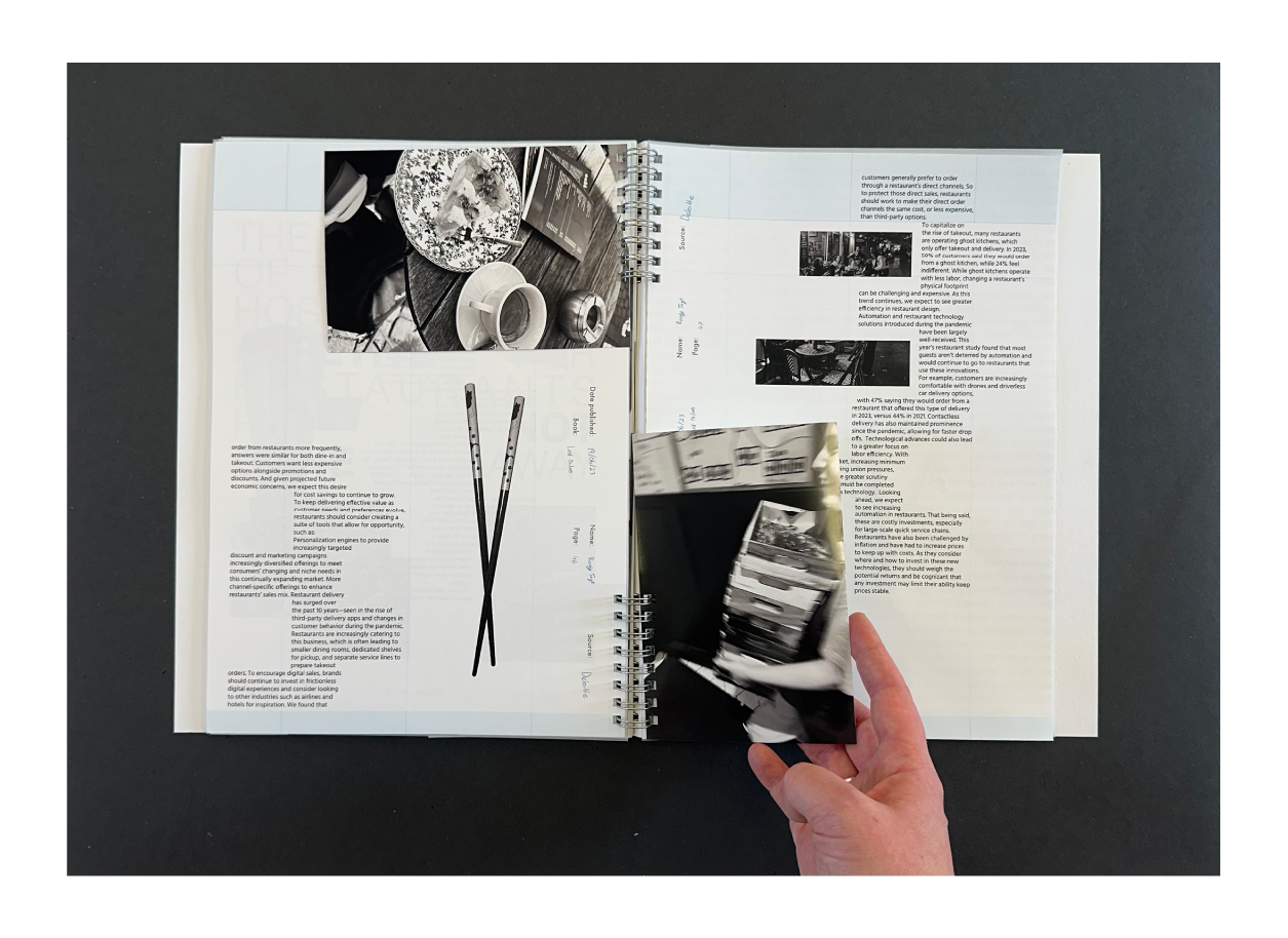
Service Charge, a printed publication that offers a unique, three-point perspective on the hospitality industry in Ireland capturing insights from the viewpoint of the consumer, the employee and the employer. Through a blend of personal commentary and real-world observation, the publication shines a light on the current state of the sector, sharing in my own lived experiences working within it.
Each chapter is punctuated by humorous and brutally honest spreads that reveal my internal monologue, often at odds with the polite, filtered tone expected in customer-facing roles. This narrative voice is central to the book’s tone, lightening the intensity of the subject matter with sharp wit and relatability. The comedic interjections are designed to keep readers not just engaged and entertained, but also empathetic to the often-overlooked realities of hospitality work.
Visually, Service Charge embraces a bold, experimental aesthetic through its use of typography and photography. The design captures the chaos and unpredictability of life in hospitality, from erratic shift patterns to unpredictable clientele. The visual language mirrors the constant tension and flux of the floor, where no two days ever play out the same.
92 days of Classic Horror
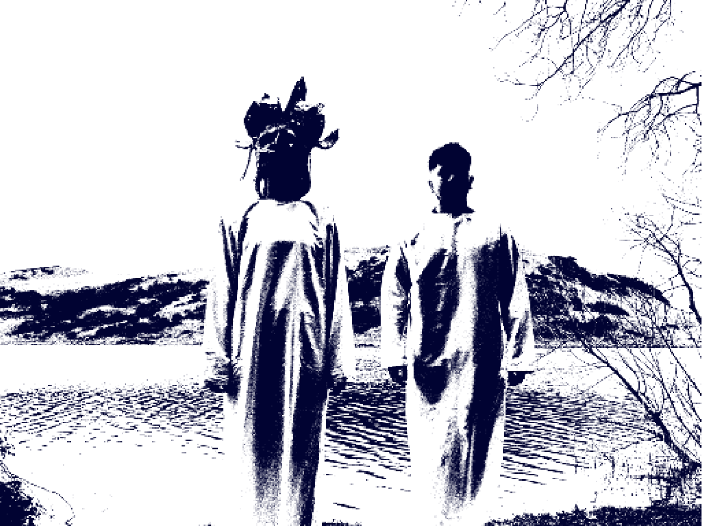
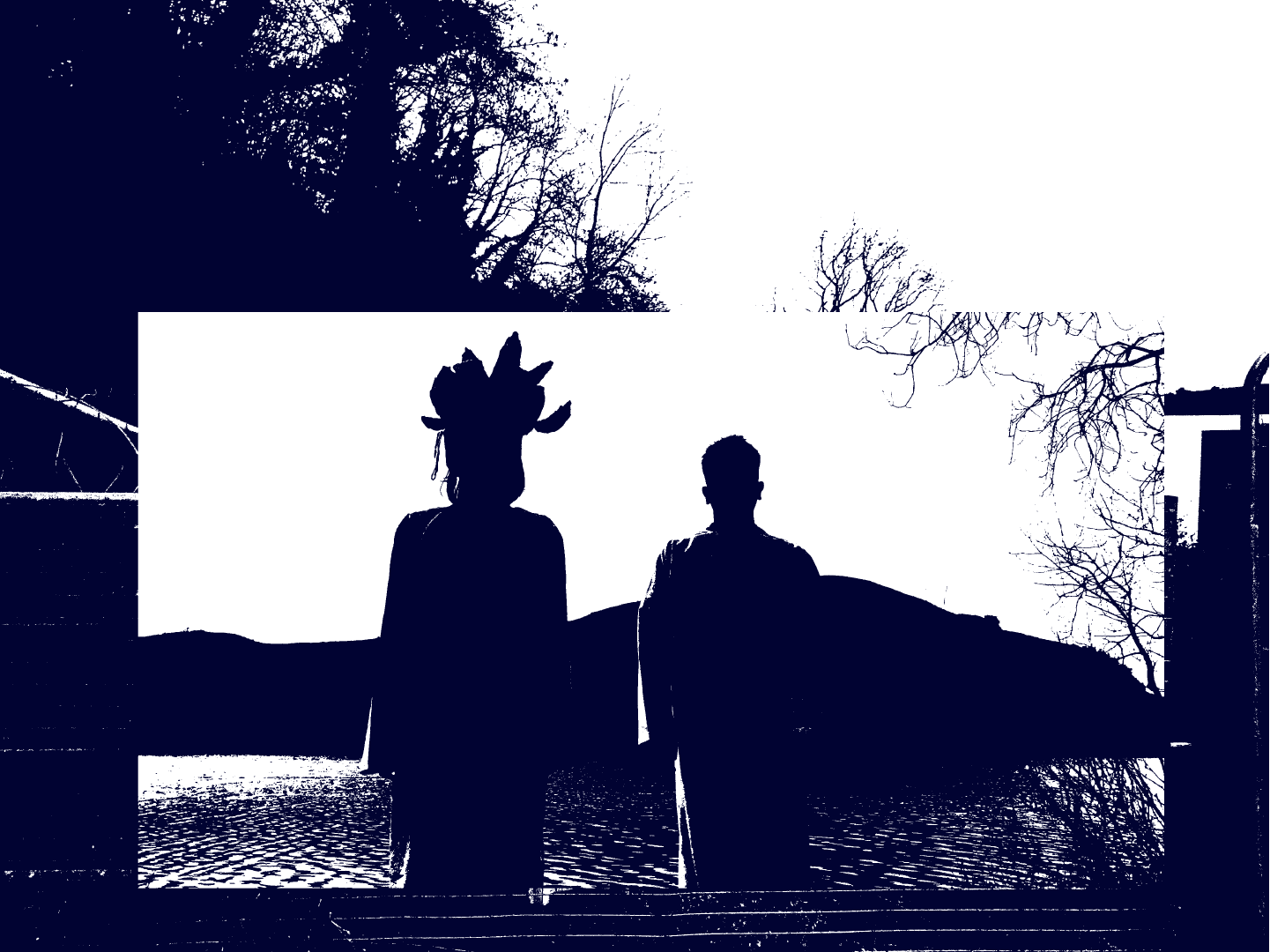
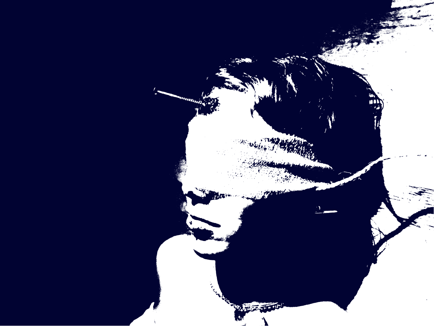
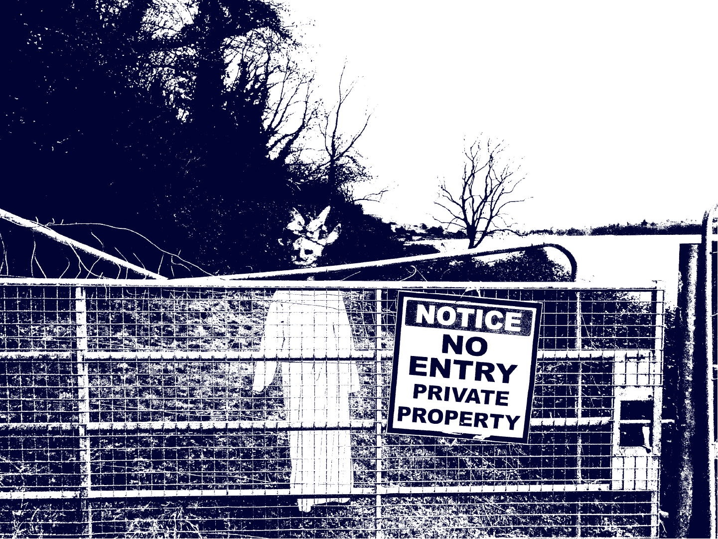
92 Days of Classic Horror is a visual narrative project composed of a series of haunting images, designed to evoke a sense of unease and eerie fascination in the viewer. The images use cool, de-saturated blue tones, chosen for their inherently cold, distant, and haunting emotional resonance. This palette not only reinforces the chilling atmosphere but also gives the imagery a dreamlike quality blurring the line between beauty and fear.
At the heart of the work there are two storylines, each adding depth and tension to the project. The first storyline follows a mysterious and elusive cult, led by a figure whose face is always hidden behind a mask. This anonymity enhances the leader’s eerie presence and mystique, evoking a sense of paranoia in the viewer. The second narrative centers on a young woman trapped in a tricky situation, held captive by an unhinged killer. Her story unfolds slowly through subtle visual cues, inviting viewers to piece together her fate while remaining on edge.
Together, these stories create a psychological horror experience that does not stick to traditional gore or shock value. The project instead leans into atmospheric storytelling, leaving space for interpretation.
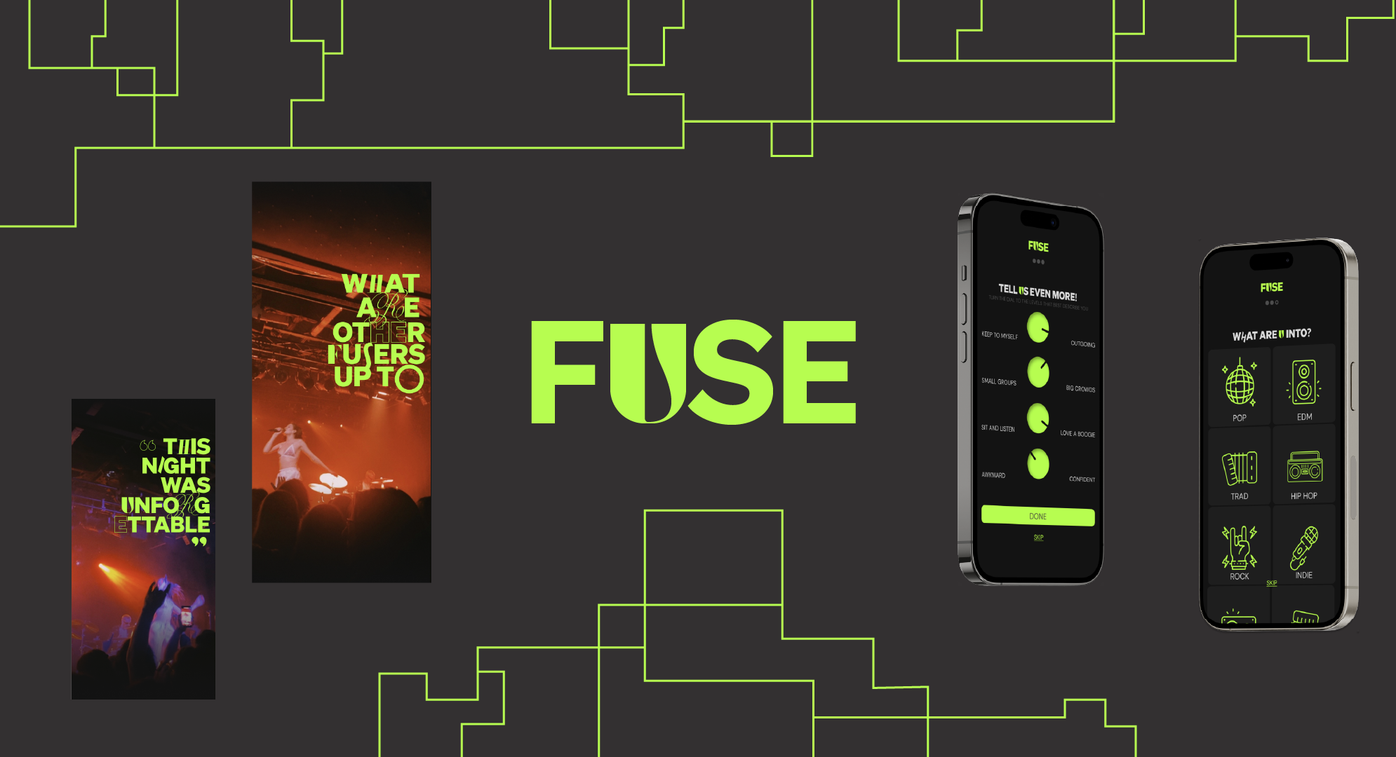
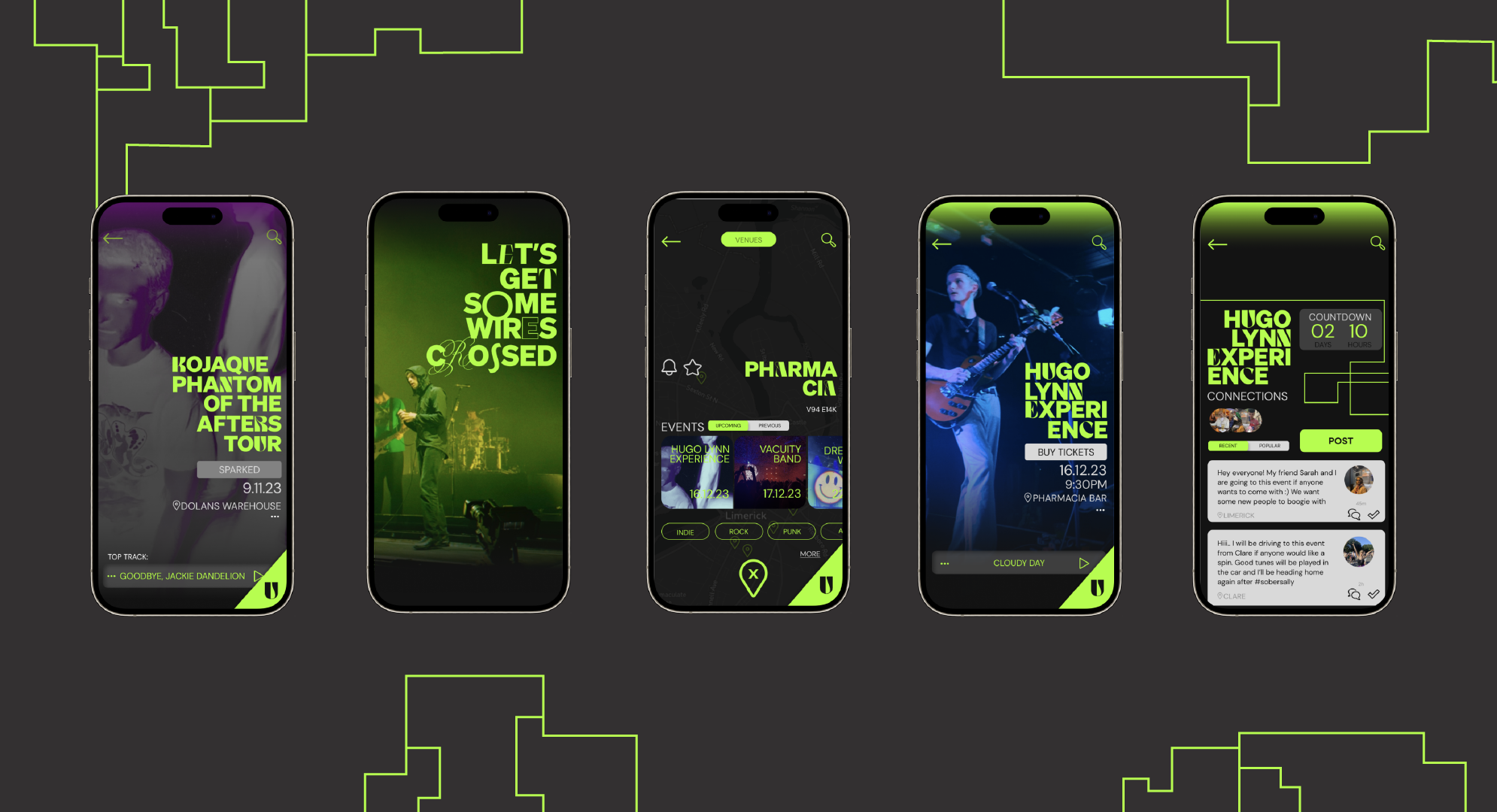
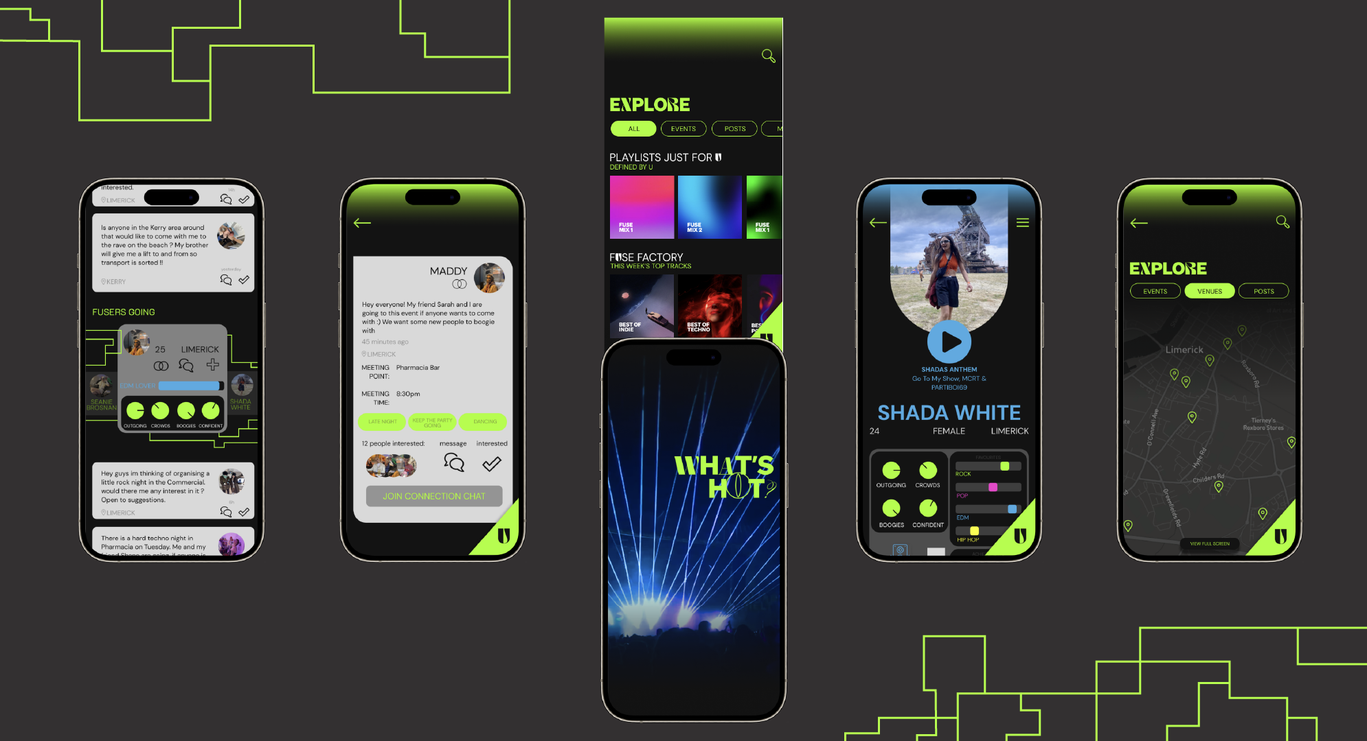
FUSE
FUSE is a collaborative digital product design aimed at bringing people together through their shared love for music. Designed as a social and exploratory platform, FUSE empowers users also known as ‘Fusers’ to connect, discover, and immerse themselves in new music experiences.
Whether it’s uncovering hidden local music scenes in unfamiliar cities or diving into genres they’ve never explored before, FUSE provides users with the tools to expand their musical horizons. At its core, the app is about creating meaningful connections between people, places, and sounds through the universal language of music.
The visual identity of FUSE is defined by bold, expressive typography and a warm, approachable tone. This combination reinforces the product’s inclusive and energetic spirit, reflecting its commitment to authenticity, creativity, and community.