-

- Gillian Hayes
Gillian
Hayes
UNMATCHED
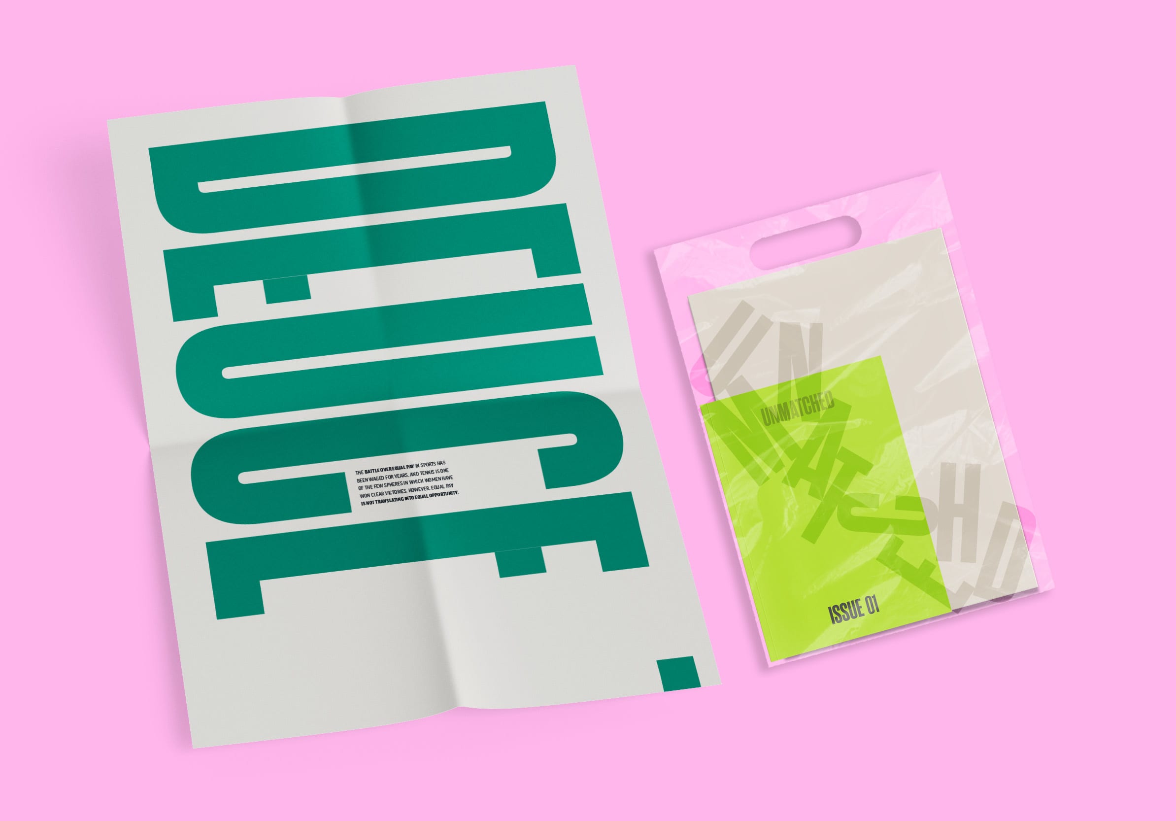
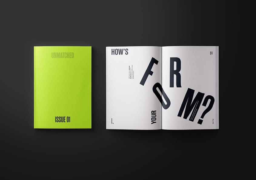
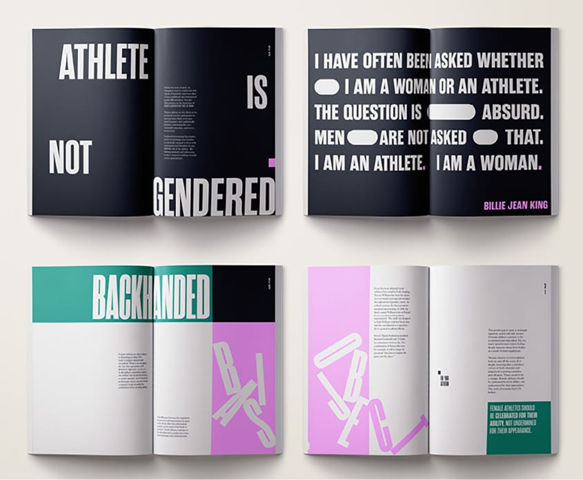
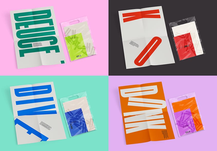
UNMATCHED is a print publication highlighting the issue of gender inequality in professional sport. The typographic expression is bold and unapologetic playing on scale, colour and composition with the overall concept relating to the idea of form, relevant to any sport. The letterforms mimic the unrest and unevenness of the gender bias, taking direct visual inspiration from each sport and its structure. For example, tennis works in the diagonal beginning with an opposite serve as the ball is followed back and forth, so the copy reads from right to left, right to left with the gutter treated as the ‘net’. Gradually the letterforms become displaced throughout the publication to suggest the deconstruction of the bias, exposing the extent of this social dilemma.
The publication series aims to put confidence and empowerment back into the argument, making readers aware that each and every sport has its own gendered problems. Each issue contains an A2 poster, both presented in a clear wrap to address the general lack of transparency on the problem, with Issue 01 solely focusing on tennis. As suggested, possible series roll out would see each issue further case study individual sports such as boxing, swimming and basketball.